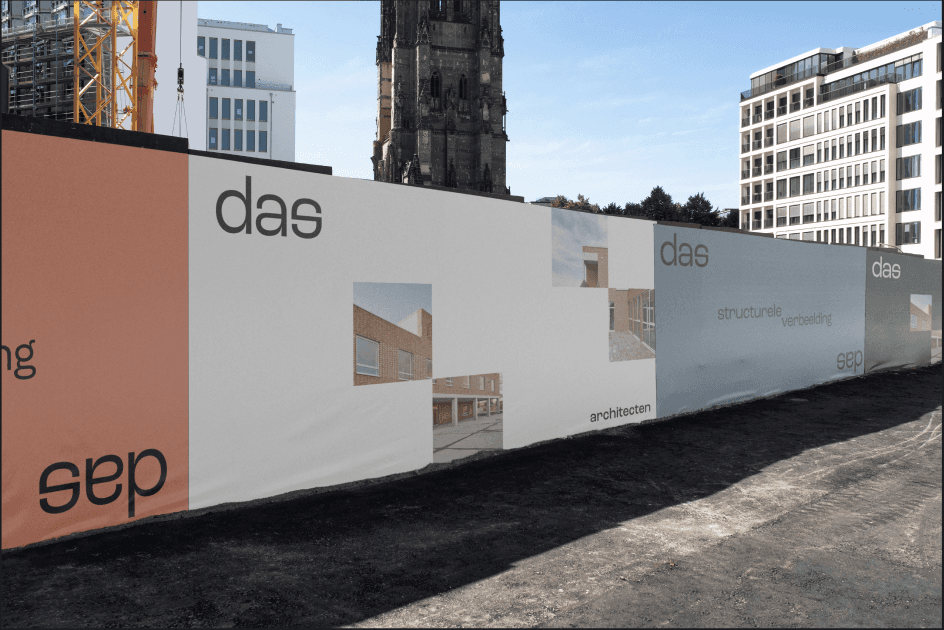
An identity designed to reflect the values of the architecture studio.
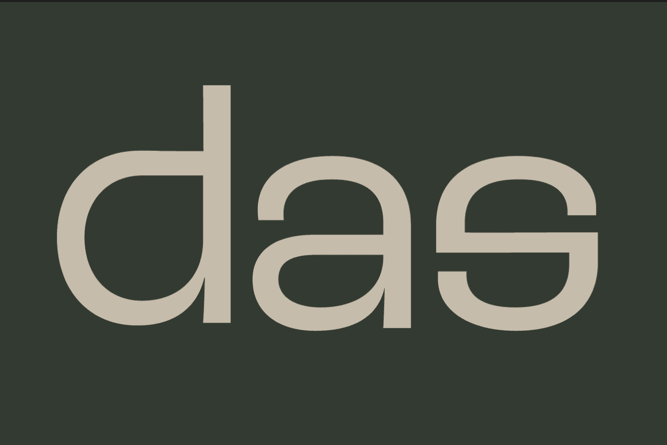
The letter “s” originates from the upper curve of the “a”, mirrored vertically and horizontally to create a cohesive visual system. The result is a subtle nod to the sense of structure, order, and commitment that characterises das.
Category:
Branding
Client:
das
Location:
Leuven