The Wire Sisters
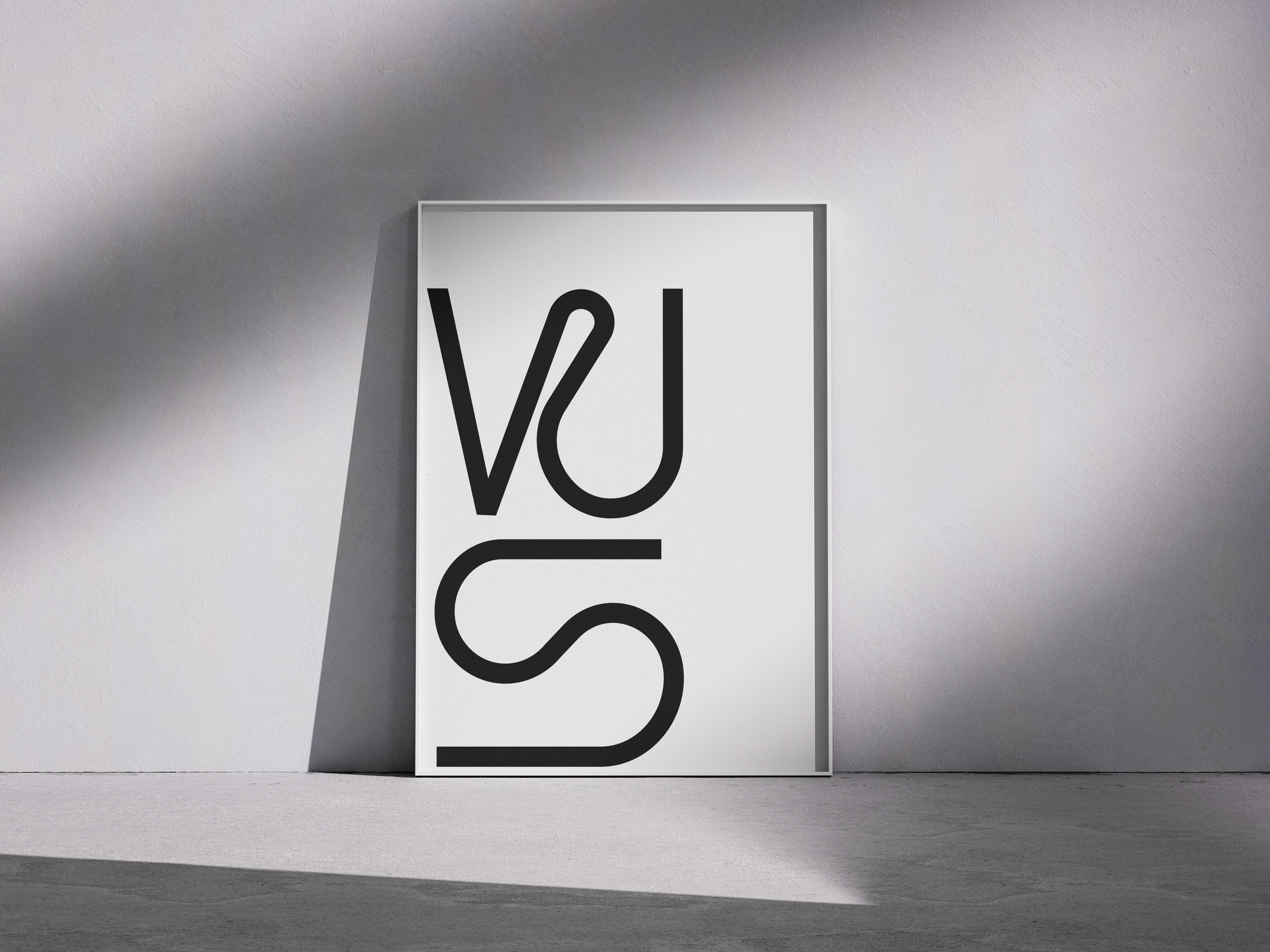
The logo for The Wire Sisters, a female DJ duo with a funky and playful style, is a bold visual statement that reflects their identity in a unique way.
Monogram & construction
The identity is built around a monogram combining the initials “W” and “S”. The forms are inspired by wire-like lines, flowing and organic, yet controlled and precise. This creates a groovy, funky character with a clean and contemporary finish.
Symbolism of the letters
The “W” was developed as the starting point, from which the “S” naturally emerged. This reflects the idea of sisters originating from the same foundation. Similar in essence, yet each with their own shape and character. The letters evolve from one another, much like how sisters complement and support each other.
Style & energy
The logo combines organic linework with structured typography, mirroring the energy of the duo: feminine, distinctive, playful, yet strong. It translates their musical identity into a visual form. Funky, approachable, and with a subtle edge of rebellion.
Category:
Branding
Client:
The Wire Sisters